28 Jan 2009

Schmap!


Anyone ever heard of Schmap?

Schmap "is a leading publisher of digital travel guides for 200 destinations throughout the United States, Europe, Canada, Australia and New Zealand. More than 90 million Schmap Guides have been downloaded since first released in March 2006: this phenomonally popular series can also be browsed online, with versions optimised for iPhone and Nokia users."

I recieved a "flickrmail" not so long ago from the managing editor Emma Williams, saying a piece of my photography has been included in the sixth edition. The photograph in question is of the iconic Printworks in Manchester's city centre

my work as seen on the iPhone version of Schamp!

The photo itself published to flickr.com:

The Printworks

8 Jan 2009

The Interactive Playground of Paul Neave

Paul Neave, is a British interactive designer who claims his title is "a fancy way of saying I make interactive tools and toys, everything from games to applications, from experimental interactive art to intuitive user interfaces".

It is this less than serious approach that becomes quite distinct in Neave's work. For example his site, (www.neave.com) showcases some very experimental pieces that would appear to have been created purely for Paul's own pleasure.

True to his word, the site itself accurately represents the attitude of the designer. That is to say the clean simplicity of the design is in itself functional yet visually quite appealing, when compared to more traditional primarily HTML based domains. By liberally using small Flash elements within the HTML Neave's site appears intuitive and responsive than just HTML without the lag and technology issues that can easily result from purely Flash based domains.

And Neave's re-creations or "tributes" to some classic arcade machines will always be popular, as they are created with such attention to detail they are almost indistuingishable from the originals.

www.neave.com

9 Mar 2008

Alex Dragulescu - Know Your Enemy

Alex Dragulescu is the award winning artist responsible for the Know Your Enemy "project" by MessageLabs (www.messagelabs.co.uk). In which Dragulescu created a program that is capable of reading the structural code of a given computer virus, and develop a rendered image that shows graphically what the virus "looks like". This may altogether seem a rather pointless task as it seems on the surface, however an interesting concept with some even more interesting and eye-catching results.


9 Jan 2008

Part 14: Susan Kare

Widely known for her iconic interface graphics, Susan Kare is an artist and graphic designer. Perhaps her mostly readily documented works are those for Apple Computers Inc in the 1980s. Below are some examples.


As a multimedia student I find this work to be of particular interest due to its success, and the reasons for such accreditation. For instance such works must have certain traits for them to be of any use. In this instance, Kare is restricted by technological capabilities, such as efficient use of memory. For example these icons would be of no use to Apple if an excessive amount of memory is needed for them to function. Despite such limitations Kare has achieved designs so effective as to be readily recognisable and user friendly that no formal training is needed for their understanding. As well as managing to keep the designs sufficiently simple in order to comply with the capabilities of the hardware.

What is more is that the concept of such works are still in use 20 years on, with primarily only alterations to the quality of their appearance - this is in line with advancements in the capabilities of the hardware they are intended for.


4 Jan 2008

Part 13: Lauren Child

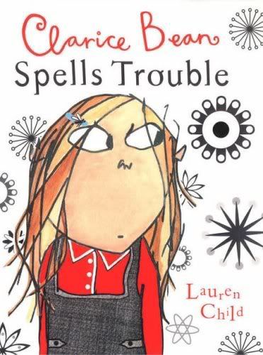
Perhaps most known for writing the Charlie and Lola books, Lauren Child is a English illustrator and successful author. Instanly recognisable is her collage-like style, in which she combines any number of mediums from magazine cuttings to material or photography and even traditional watercolours.


Personally I find myself less than impressed with such works. Although I can appreciate how appealing they appear to young audiences, I find the seemingly inconsistent look to this work somewhat unappealing from an aesthetic perspective. However creative and 'of its time' it may be it is not a style I would aim to emulate any time soon. Perhaps it is appropriate that such works are targeted for much younger audiences, as the style is reminiscent of creative styles often seen in school art classes, particularly in the case of the intended audience of such pieces.

2 Jan 2008

Part 12: Otto Seibold

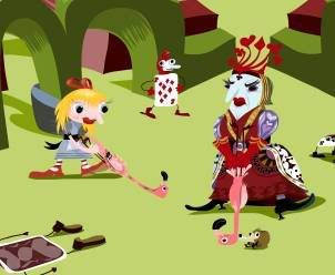
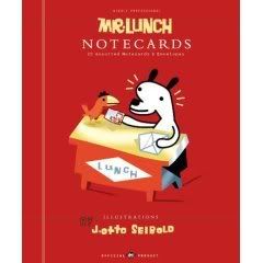
As an illustrator of children's books J.Otto Seibold is perhaps best known for illustrations of children's books, and in particular those of author wife, Vivian Walsh.


As we can see from the examples above, Seibold's style is somewhat graphic in style, almost vector-like in appearance. This highly graphic, brightly coloured style is highly appealing to younger audiences, as well as, recently at least, artists alike. As a trend in design I am not convinced this is the style for me so to speak. However I cannot deny its appeal, and as such its success. Yet this is not to say that because it is successful from a commercial perspective, it is successful from a personal stand-point.

1 Jan 2008

Part 11: David Carson

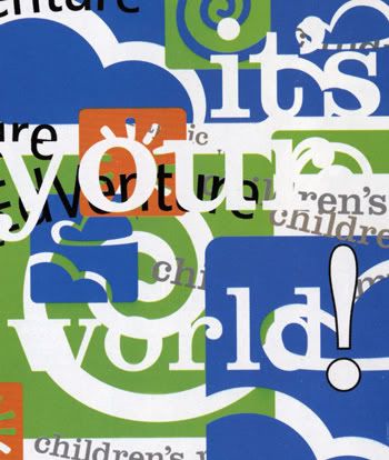
Widely renowned for his experiemtal typography and innovative magazine design work, David Carson is an American graphic designer...and its clearly evident through his works.


As we can see from the images above, Carson's work seems very experimental, perhaps even to the point where the final typography may even be illegible. This also invites the audience to interpret the work in a more personal sense. Perhaps likened to an inkblot test though less so. Overall I like the impact of Carson's work, and the potent presence of the work has led to Carson's clear success.