Kids nationwide, if not globally will no longer have to face the sheer trauma of being told no when asking if they can have a pet. Thanks to the new EyePet for Sony's PS3 system.
It seems like a very interesting and, from the E3 previews at least, a very polished product. However I guess this is Sony and there are moments in the video above that could shatter the magic that Sony seem to be selling to anyone evenly remotely impressionable.
Using the new generation augmented reality, the EyePet appears like a fascinating idea but in a way kinda gimmicky. That said it is clearly a stepping stone to bigger and better things to come.
Oh and when I said no more trauma over pets....thats if the parents agree to forking out for a PS3, Playstation Camera and the game...
5 Oct 2009
29 Sept 2009
Hand From Above

Walking through Liverpool city centre last week I came across this most unusual sight. The BBC screen being used in a slightly less than factual manner.
"New commission Hand From Above encourages us to question our normal routine when we often find ourselves rushing from one destination to another. Inspired by Land of the Giants and Goliath, Chris O’Shea reminds us of mythical stories by mischievously unleashing a giant hand from the BBC Big Screen. Passers by will be playfully transformed. What if humans weren’t on top of the food chain?… We will soon find out."
An interesting concept and nicely presented though I have to admit its nice to see something thats less focused on the final presentation and has abit of an edgier almost unfinished appearance. By that I mean it doesn't 'look' as though it was made for such an enormous screen; more like a project thrown together in the back room of an enthusiastic amateur.
It certainly seemed to catch the attention if not the minds and maybe even hearts of the passers-by.
21 Aug 2009
Marketing Innovation Group
Just a quick blog to comment on my recent, it has to be said, short term placement at MIG, (Check them out here). That is short term of my own decision as I found the work did not represent what I wanted to achieve from a work placement.
I undertook just over a week of placement work at the Marketing Innovation Group in Knutsford this summer, where I found myself being asked to build the sort of email adverts/newsletters many of us are likely to recieve regularly from various companies/brands, (details ommitted to comply with confidentiality disclosure agreement).
As well as building emails I was asked to create animated GIF images. Oh the giddy highs of design work. I had no problem with the work I was asked to do, and it has to be said I learnt alot but I do feel it isn't the work for me.
Now I understand it was only a short term placement and perhaps not the best representation, with regards to relevance of the work offered, to my course discipline but I have since as a direct result of this experience decided to explore other avenues of work in more detail. Primarily as I found this method rigorously structural and regimented. Albeit effective as a business practice I don't think this is the sort of work I would wish to seek employment in after graduation.
19 May 2009
Droppings....
BallDroppings that is.

Odd title but uncannily accurate. BallDroppings is a processing-driven application almost musical in its nature. Musical in the sense that by drawing lines, you are able to turn a series of 'blink', 'clink' and 'dink' noises into something remotely musical...just don't expect to make the charts anytime soon.
All in all a seemingly simple, yet addictive concept, with alot of potential in the right context.
See it in action here!
13 May 2009
NIN goes Interactive

Featured recently in both Creative Review and Wired, are American industrial rockers NIN, (aka Nine Inch Nails). However this has nothing to do with their music...as such.
The band's latest tour, 'Lights In The Sky', the band have gone all spontaneous; and have achieved what I think is a first in live music.
"For the band's current Lights in the Sky tour, Reznor has not only raised the bar for what's possible in an arena tour, but has also produced what could arguably be one of the most technologically ambitious rock productions ever conceived. Unlike most rock shows, the visuals for about 40 percent of the show (including "Only") aren't pre-rendered. There's no staging, no pantomiming by band members: It's all interactive, live and rendered on the fly.
With more than 40 tons of lighting and stage rigging, hundreds of LED lights, a daunting array of professional and custom-built machinery running both archaic and standard commercial VJ software, three different video systems and an array of sensors and cameras, the tour is nothing if not a lavish display of techno wizardry."
See the full article at Wired.com here.

Personally I find this indicative of the advance of interactive art, and perhaps a resurgence in its popularity. This idea of using computers for spontaneous expression. Perhaps NIN has opened a door, I suspect other artists/bands may well be inclined to follow them through it. I guess whether interaction on such a level will make any difference to the performance or its appeal is yet to be seen. Maybe this is the future and it will become the norm for musicians to take complete control of their on-stage performances.
6 May 2009
Boundary Functions
Through research for my upcoming dissertation, (and the much closer dissertation proposal presentation) I have been feverishly researching and discovering as much new interactive works as time deems possible. Through such I have discovered an interactive designer known as Scott Snibbe. Who is responsible for a work called Boundary Functions, (see below).
Snibbe works primarily on the floor...that is to say a large proportion of his interactive works centre around an area of flooring that in someway reacts to analog input from users, passers-by, etc.
I found Boundary Functions to be of particular interest as true to the nature of 'interactive art' it explores analog human traits in a digital environment. That is to say Boundary Functions effectively creates a digital representation of something about us as individuals that, in this instance, may otherwise not have a physical presence as such.
Boundary Functions, to me, visualises that idea we all have about personal space. As can be seen from the demonstration above, this 'space' or 'boundary' adapts and changes depending on variables such as the number of people in the space, contact with these people and of course the relative position of said individuals. A simple yet intrigueing piece of visual interactive art that is, I think, capable of provoking thought in even the most casual of participants in the piece.
20 Mar 2009
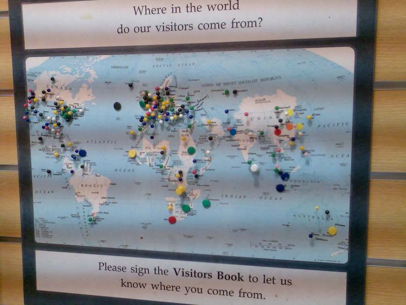
Data Representation
Hows this for a visual representation of data? Found in the Wrexham Tourist Information Centre, people are invited to place a pin on this map to indicate where they are from. The result is.....well its a map with pins attached in different places, but over time this begins to show patterns and trends in the origins of the visitors to Wrexham.
19 Mar 2009
An Inconvenient Truth

A film that is; its fair to say, of the moment. A film that touches on a delicate political as well as moral issue - the state of our environment and our seemingly catastrophic effect on it, also known as global warming...
But we're not interested in that, we're far more interested in the charts, graphs, illustrations, motion graphics, and even 3D animations used in Al Gore's presentation...obviously.
That might sound daft but there is a method to the seemingly apparent madness; as this film shows not only that data/information does not need to always be shown in the everyday forms we are all accustomed to, but that it is in the variety of the presentation that really gets the point across to your audience. In the film Gore uses a number of methods, (conventional and less so) to illustrate the points made and I think it is this variety that keeps audience's attention and prevents the presentation from stagnating and the audience 'losing the plot'.
Below are a few stills from the film...
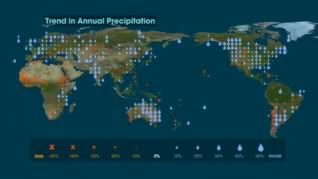
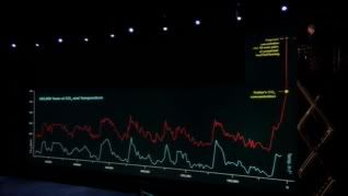
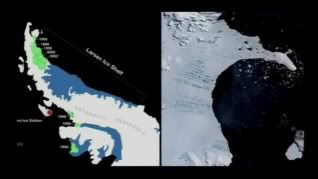
Overall an excellent film, which really hits home, primarily if not wholly due to the methods of data presentation and the way in which the message is communicated.
10 Mar 2009
Andreas Gursky
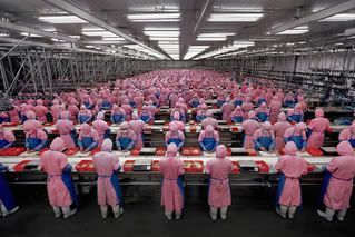 | 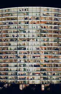 |
Through research for the Data Collection and Information brief I have come across the work of German photographer Andreas Gursky; known for his truely large scale prints - some of which measure 6x10ft and more!
The sheer scale of such works is impressive yet this only works if the content is there. With Gursky's work this seems to be the case. By standing back, and observing a given scene/scenario as an external observer looking in, Gursky's captures appear somewhat distant and emotionless. Where works such as David Bailey employed techniques such as cropping to the point of removing a subject's limbs in order to achieve a resonating emotional connection between the image and the audience; Andreas Gursky has a somewhat reverse approach. His recording of the scene allows the audience/viewer to step back and detach themselves from the image and to an extent perhaps limiting or at least reasoning the audience's interpretation by removing the emotional connection.
I suppose the magical element to Gursky's work does lie in the scale, as the images presented are photographs they retain the innate habit of photographs which is their high level of detail.

3 Mar 2009
Fallon
The latest in the series of ads for a brand that suffice to say, (and on the face of it may appear they agree) don't need to take their advertising campaign all too seriously.
Produced by the London 'branch' of the American design agency Fallon, Fallon London are known for many memorable ad-campaigns such as "bring on the trumpets" which in itself has spawned a devoted fanbase. However they are perhaps most well known as the creators of the Cadbury series of ads. Notably featuring toy models of airport vehicles, a talented gorilla, and most recently a pair of kids with an unusual skill, (or so it would seem if it wasn't for post-production).
The latest of these ads, (as seen above) needs no introduction, (like the brand it represents ironically) follows in the tradition of the series yet only having looked at it, (and it predecessors) closely have I noticed just how well put together these ads really are.
For instance, it would appear on the surface to have no relation to the brand whatsoever, however Fallon have placed subtle keys within the visuals. Such as the purple boards in the "gorilla" spot, and the purple clothing worn by the young girl in the "eyebrows" spot which are direct links to the colour scheme of the brand.
Also, as a whole, the ads may seem to be completely unrelated in terms of topic, and compared to one another this may well be the case. Yet the smallest amount of research into the nature of the product(s) these ads represent and the effects on the human body will show that chocolate forces the production of something called endorphines or 'the happy chemical'. I think it is this effect that the ads are intended to create/simulate so to speak. That is the ads are intended to be a sort of 'visual chocolate' if you like, to raise a smile.
With all the hype surrounding these adverts, it looks like Fallon succeeded...
5 Feb 2009
Flight404
Working under the name Flight404, Robert Hodgin spends all day "creating with code". On the face of it that might sound kind of dull. But when its creating things like the rather beautiful example above I see someone who is passionate about what they do, and as a result produces really quite inspiring pieces of work. Hodson claims such pieces are created with the open source java-based language Processing, (or Proce55ing).
Through tutorials at North Wales School of Art and Design I have looked at Processing and in a sense the extension of that which is the Arduino. I have since realised it is likely this if not a similar java-based scripting language which drives Apple's iTunes visualisation I blogged about yesterday.
4 Feb 2009
Music is movement
First of all for anyone that doesn't recognise it, the video above is a short clip of iTunes latest visualiser in action. Now I've had iTunes for a good while now and its fair to say I make regular use of this free software. Its intuitive, quick to respond, and with its ability to play a wide range of sound file formats; ideal access to any and all music, (using Apple's 'genius' store if you so wish). But despite its merits, its not the program I'm interested in here, (though interesting it may be).
It is only today that I realised just how simply mesmerising the standard visualisation is. Before you say it no I haven't been taking anything, and I know its probably not exactly complicated when you know how to make these things. I just think this particular visualisation should be recognised as the piece of art it clearly is. No ok its not a painting by some great master or anything that might be considered even remotely traditional and I imagine it relies a great deal on mathematics which as we all know is a subject based purely in logic and rules. Yet this seems to 'defy' such boundaries and maybe its as a result of this that it is so visually appealing.
That and it interacts with the music playing which is always cool.....
28 Jan 2009
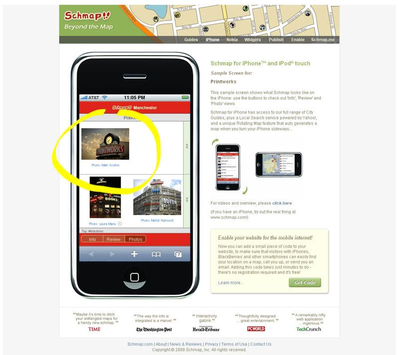
Schmap!

Anyone ever heard of Schmap?
Schmap "is a leading publisher of digital travel guides for 200 destinations throughout the United States, Europe, Canada, Australia and New Zealand. More than 90 million Schmap Guides have been downloaded since first released in March 2006: this phenomonally popular series can also be browsed online, with versions optimised for iPhone and Nokia users."
I recieved a "flickrmail" not so long ago from the managing editor Emma Williams, saying a piece of my photography has been included in the sixth edition. The photograph in question is of the iconic Printworks in Manchester's city centre

8 Jan 2009
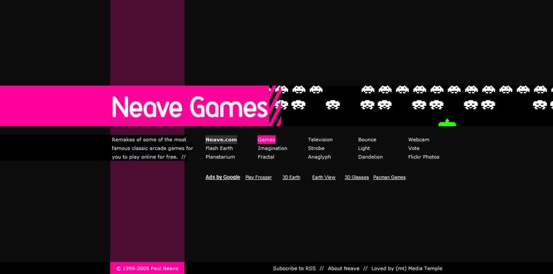
The Interactive Playground of Paul Neave
Paul Neave, is a British interactive designer who claims his title is "a fancy way of saying I make interactive tools and toys, everything from games to applications, from experimental interactive art to intuitive user interfaces".
It is this less than serious approach that becomes quite distinct in Neave's work. For example his site, (www.neave.com) showcases some very experimental pieces that would appear to have been created purely for Paul's own pleasure.
True to his word, the site itself accurately represents the attitude of the designer. That is to say the clean simplicity of the design is in itself functional yet visually quite appealing, when compared to more traditional primarily HTML based domains. By liberally using small Flash elements within the HTML Neave's site appears intuitive and responsive than just HTML without the lag and technology issues that can easily result from purely Flash based domains.
And Neave's re-creations or "tributes" to some classic arcade machines will always be popular, as they are created with such attention to detail they are almost indistuingishable from the originals.
Subscribe to:
Comments (Atom)

