31 Dec 2007

Part 10: Meta Design

"We combine the art and logic of design to help organizations compete."

This is the single quote, visitors are greeted with upon visiting Meta Design's site. But what exactly does it mean?


As we can see from the examples above, Meta Design seem devoted to the simple yet dramatic designs and logos. From a personal perspective, this is a style I find myself quite drawn to. The powerful presence of such designs is clearly evident, and as such makes them stand out from the competition. All Meta Design's work gives a very clean cut image, both of the company and the client the piece is intended for. Overall I think these are potent pieces of design, and as such very effective, even inspirational work.

30 Dec 2007

Part 9: Tomato

As a multi-disciplinary team across numerous different fields, Tomato is a design collective including the music of Underworld, typography, architecture, filmmaking, and branding. Since the establishment of Tomato Interactive, (the interactive design collective) in 1998, they have firmly established themselves as leaders in Shockwave and Flash design.

As an example of their work I find the above image, rather appealing. As web-design is perhaps one of the biggest areas in the field of interactive design, it is of paramount importance that good design is maintained through all such practices. As a piece of web-design I think the above is very successful, as not only does it have appropriate but not excessive use of colour(s) but it is inherently simple for any user to navigate and use this design - something which is ultimately the most important aspect of interactivity.

Although images seem a little thin on the ground in this instance, I find the work produced by Tomato, very appealing in terms of its apparent simplicity, (particularly in terms of usability), while managing to maintain an appropriate aesthetic appearance to the piece.

28 Dec 2007

Part 8: Ronald Searle

Perhaps most notable for his creation of St Trinian's School, Ronald Searle is an English cartoonist.


As we can see from the image above, Searle has his own style, although upon first glance this seems vaguely familiar. Though this may be more a reflection of this style in the work of later artist's/designers. The very free-hand almost irrational style of image, in my mind, has become associated with the Penguin Classic range of books, (like the example above). However this may just be a reaction to being so accustomed to seeing this style of image associated with this range of books. The very 'basic' appearance to the colouring of Searle's work seems almost aggresive in nature.


Personally I am not such a big fan of Searle's work, and as such don't really have all that much to say on the subject. As a general rule I tend to be less interested in very illustrative styles, as oppposed to the more refined appearance of computer-based work, and in particular, that of the moving image.

26 Dec 2007

Part 7: Kathleen Hale

The first of many female artists to grace this blog, Kathleen Hale is perhaps most famous for her creation Orlando, the Marmalade Cat, whom she created to entertain her children before bed. Hale was a British artist, illustrator, and children's author. As Orlando's creator she was awarede the OBE in 1976.


Although not the best regarding image quality - the above example shows Hale's distinct almost playful illustrative style. A feature of her work that captivated her audience and made her success. Not being an illustrator myself, it would be difficult to judge this accordingly, and as such this style does not particularly stand-out against similar such works from a personal perpspective. However having said that it becomes clear when I look at such work why it became so popular, and indeed so appealing to children and publisher's alike. The basic yet effective use of colour, draws in the eye to such an extent it is unlikely many children would be uninterested....perhaps even to the point where the story/character(s) illustrated become obsolete as far as the child is concerned.

When we start to look closer at Hale's work we begin to get an idea why she became so successful. For instance in the illustration above we can see how she uses composition so dynamically that the audience, (particularly children) can almost instanly recognise and relate to the situation and character(s). For example the illustration above is accompanied by the following text:

"This patient, Grace reminded Orlando as they approached from the fourth bed, is suffering from a broken heart"
When we look at the two pieces of information in context we can immediately recognise how Hale has chosen to illustrate the scene for maximum visual legibility. However this raises the question do we need to read the text to understand the illustration? Does it make it successful if we can or unsuccessful if we are unable to do so?

One thing is certain......Kathleen Hale was very successful in her work.

24 Dec 2007

Part 6: Pentagram

Pentagram states on its website: "Pentagram provides design services across the full spectrum of graphics, identity, architecture, interiors, and products. Our multi-disciplinary structure, with teams from different disciplines working in the same environment, promotes a culture of interchange that adds tremendous value to all creative thinking" However it just sounds to me like they are trying to be all things to everyone. Unfortunately this jargon-based mind-set is evident through the works produced by the company. As its most related to my own practice, I will focus on their Interactive works.


The above image is "Sugar, the revolutionary user interface developed for One Laptop Per Child, the initiative to put laptops in the hands of children from developing countries worldwide." which personally appears too complex for its intended purpose. For instance it does not appear that it could be used so readily by unfamiliar users.


Similarly if we look at the site design above, we may instantly see the similarities between this and Pentagram's own site, (http://www.pentagram.com/). The simple appearance is surely easy to use by unfamiliar audiences however as far as creativity is concerned, Pentagram may appear lacking in imagination. However there are some exceptions.

Although it may break several so-called "rules" of web design I actually quite like the above piece developed to market office space in New York. Of course there are areas it could be improved, as with any creative work but overall I find this quite inspiring as such. All in all I am not that impressed with Pentagram, however there are positives to its work.

23 Dec 2007

Part 5: Eboy

Occasionally referred to as the "Godfather's of Pixel", Eboy is a pixel art group, (rather than an individual) founded in 1998 by Steffen Stauerteig, Svend Smital, Kai Vermehr. This trio collaborate with New York based Peter Stemmler to produce iconic graphic design work for companies. Below is a prime example of such work.

With its retro appearance, Eboy made its name from the immensely popular pixel-art methods. Incredibly time consuming, it is difficult not to appreciate the amount of work that goes into such an image. In line with the current fad, I find myself very interested in this type of imaging. Although it may look simple and very straightforward, only the latter of these is true. That is the method by which such images are created is relatively straightforward, however they're creation is perhaps not so simple and perfecting the effect is even less so.


Although the create may be simple, once the technique is mastered, Eboy's images are far from simple in their construction. Each image is filled with action and numerous points of interest within the image. Not only does this add to their appeal but it also keeps the viewer interested for much longer, as upon each glance the audience is likely to notice something new that they had not seen before. It is the combination of all of these factors that make Eboy's images so appealing - the number one in a rapidly growing field of similar artists enthralled by this style.

22 Dec 2007

Part 4: Saul Bass

Academy award-winning filmaker and graphic designer, Saul Bass is perhaps best known for his seemingly inherent skill for design on animated motion picture title sequences. Possibly the most notable of which is his work for Preminger's The Man With The Golden Arm.

A concept carried by more than one of Bass' designs.

From this we can clearly see Bass' roots in graphic design. As was the case with Peter Saville, Bass' simple highly graphic style conveys the purpose in its most basic form. A long standing traditional style in such a field. Even with little to no use of image, Bass' work was considered the best as far as animated title sequences go.

It is such work that I find so appealing with regards to my own practice, as the moving image is an area of personal interest. However it is more concerned with the ways in which such effects are achieved and the effectiveness of the solution(s) created rather than the purpose as such. For instance in the image above, we see how Bass uses no images yet is still able to create a sense of drama/suspense in the build-up to the feature - a mark of 'true' design ability.

21 Dec 2007

Part 3: Peter Saville

Famous for his Factory Records record sleeves, Peter Saville is an English graphic designer. Upon first glance his work seems inherently simple. For example the cover for New Order's Blue Monday album gives such an impression.


New Order's Blue Monday album cover design

As we can see from the image above, the composition is composed of seemingly very little, (primarily geometric shapes). However this is not to take anything away from its success, or indeed the concept behind the design itself. Yet this is a shining example of simple success in what was quite a decadent decade, (1980s)...at least by modern standards. This is not only just a one-off either. As we can see if we look at some of Saville's other album cover designs, (see below).


Joy Division's Unkown Pleasures album cover design


New Order's True Faith album cover design

Gay Dad's Leisure Noise album cover design


Overall I find this style quite appealing in the sense that simplicity is not as simple to design as it may appear on the surface. It is a result of this that I have rarely found truely successful simple designs. I have attempted to adopt such a style in the past in my own practice, yet have never been really satisfied with the results.


20 Dec 2007

Part 2: John Maeda

Named as one of the 21 most important people in the 21st century by Esquire, John Maeda is perhaps most well known for his work in Design & Technology - a subject that explores the areas in which the two fields merge.
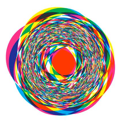


Maeda's "Fireball"


His work may at first seem far from simple...despite the focus of his latest research project entitled "Simplicity". However some particulars of his work are very interesting, at least on a purely aesthetic level. For instance his piece titled "Fireball" is one such image. In essence the image is a seemingly simple composition, yet the concept behind such work seems less so. In the image below, we can see how his style of working is adopted in a more commercial context.


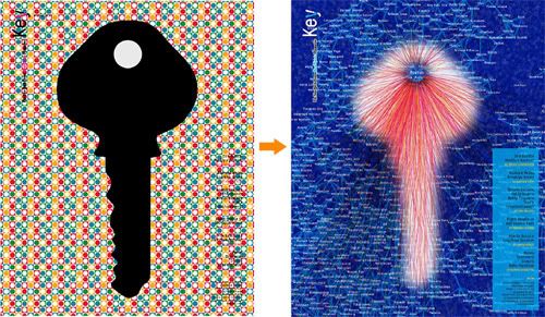
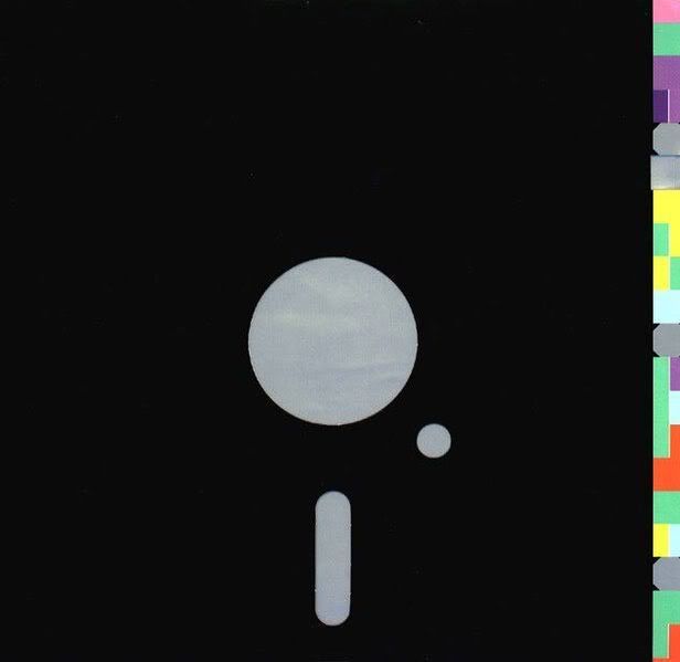
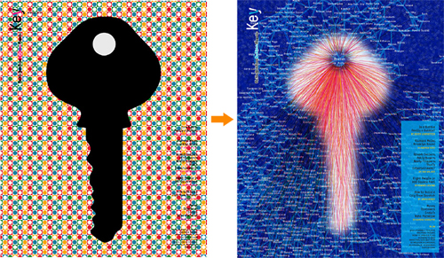
Design Process: "Key" cover


From this image we see how Maeda's very technologically-based style is formed from something quite mundane and perhaps predictable. This is just one example of how Maeda takes his work in an altogether different direction from that taken by his peers, yet retains the same purposes and practical qualities. To say this work is interesting is an understatement. Particularly when we look at some of his other works. For example Maeda's Infinity is one such piece.


"Infinity"

At first glance this may look like many different things...kinda like an ink blot test in the sense that different people may see different things. However the stark contrast of the white on black background is very eye-catching and appears to have at least a faint link to mobius strip/band. When in fact it has a closer relation to the bezier curve, as after all as Meada himself writes "My black and white image was comprised of 10,000 loops of a Bezier curve.", (http://weblogs.media.mit.edu/SIMPLICITY/archives/000148.html) Also as this post suggests the image is a comment on time and space. As I mentioned previously...the concepts behind Maeda's work are very complex.

All in all some very intriguing works, and an area which may be of direct interest to my own practice, if not a little complex for my usual aesthetics-based style.

19 Dec 2007

Part 1: James Jarvis

The unwitting father of the so-called 'designer toy phenomenom', James Jarvis is perhaps most well known for his creation of Martin for the London-based fashion company, Silas.

Jarvis' work displays a very distinct style, which although may not appeal to me personally, has clearly been successful. There is a very apparent association between his 2D and 3D pieces, which share many characteristics. For instance as we can see in the image of Martin above, Jarvis' style has a somewhat simplistic appearance, where each feature of the figure is exaggerated and detail is perhaps less than realistic.


Now if we look at some of Jarvis' other works we are can clearly see how he maintains this distinct visual style throughout his work.

Perhaps the first thing we might notice is the way in which he positions the eyes of his characters very close together. A characteristic also adopted by Nick Park for Wallace&Gromit, (see below). However this is not the only similarity shared, as we may also notice the similarity in body designs. For instance the two styles are quite soft and rounded in appearance. On the other hand there are also some distinct differences in these two styles. Such as Jarvis' characters rarely have noses, yet Parks' characters do have a slightly higher level of detail.

An illustrator by nature, Jarvis' background shines through in all his work. As we can see from the 2D work above, they share the same simplistic traits of the Martin toy he is so widely known for. As much as I may like to not become involved in the current fad for 'designer toys' it is after all a fad or trend and as such I acknowledge that as a design student I am susceptible to it and similar trends. Overall I do not consider this work to have a direct influence on my own practice. However I think this style would work well in an animation or web-based context.

18 Dec 2007

Heroes and Heroines

The Brief:

You are to begin researching all of the artists/designers/illustrators
and companies from the list below. Homing in on particular subjects which
you admire or find inspiration. Then you are to dig deeper in order to
discover what inspires and drives your subject/subjects creatively.

Inspiration = Ideas

We look to our peers for both inspiration and to drive us to reach for
higher creative goals within our design careers. It is to be a critical and
personal view of their work, not reading from found sources.

The subjects involved are well documented look hard and you will find.


The artists/designers/illustrators/companies:

James Jarvis, John Maeda, Peter Saville, Saul Bass, Eboy, Pentagram, Kathleen Hale, Ronald Searle, Tomato, Meta Design, David Carson, Otto Seibold, Lauren Child, Joel Stewart, Kyle Cooper, Micheal Gondry, David Hughes, Designers Republic, Johnny Hannah, Ian Pollock, The Chase, Vaughan Oliver, Why Not Associates, Neville Brody, Spike Jonze, John Lawrence, Hi-Res, Danny Brown, Susan Kare, Yugo Nakamura, Johnathin Barnbrook, Peter Fowler, April Germain, Lars Von Trier, Chris Ware, Ross Collins, Ian Beck

My Response:

Lets get started...