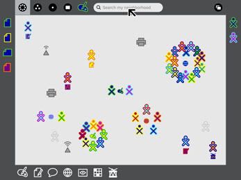
The above image is "Sugar, the revolutionary user interface developed for One Laptop Per Child, the initiative to put laptops in the hands of children from developing countries worldwide." which personally appears too complex for its intended purpose. For instance it does not appear that it could be used so readily by unfamiliar users.
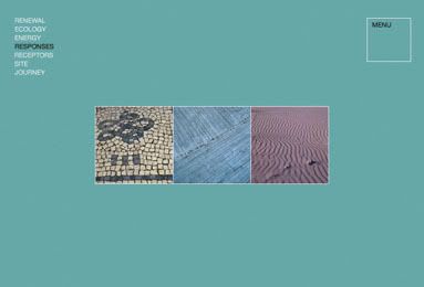
Similarly if we look at the site design above, we may instantly see the similarities between this and Pentagram's own site, (http://www.pentagram.com/). The simple appearance is surely easy to use by unfamiliar audiences however as far as creativity is concerned, Pentagram may appear lacking in imagination. However there are some exceptions.
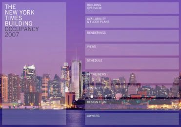
Although it may break several so-called "rules" of web design I actually quite like the above piece developed to market office space in New York. Of course there are areas it could be improved, as with any creative work but overall I find this quite inspiring as such. All in all I am not that impressed with Pentagram, however there are positives to its work.


No comments:
Post a Comment