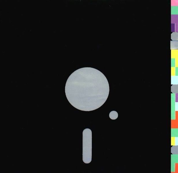
Famous for his Factory Records record sleeves, Peter Saville is an English graphic designer. Upon first glance his work seems inherently simple. For example the cover for New Order's Blue Monday album gives such an impression.

New Order's Blue Monday album cover design
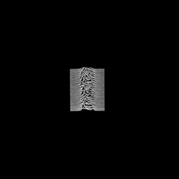
As we can see from the image above, the composition is composed of seemingly very little, (primarily geometric shapes). However this is not to take anything away from its success, or indeed the concept behind the design itself. Yet this is a shining example of simple success in what was quite a decadent decade, (1980s)...at least by modern standards. This is not only just a one-off either. As we can see if we look at some of Saville's other album cover designs, (see below).
Joy Division's Unkown Pleasures album cover design

New Order's True Faith album cover design

Gay Dad's Leisure Noise album cover design
Overall I find this style quite appealing in the sense that simplicity is not as simple to design as it may appear on the surface. It is a result of this that I have rarely found truely successful simple designs. I have attempted to adopt such a style in the past in my own practice, yet have never been really satisfied with the results.


No comments:
Post a Comment