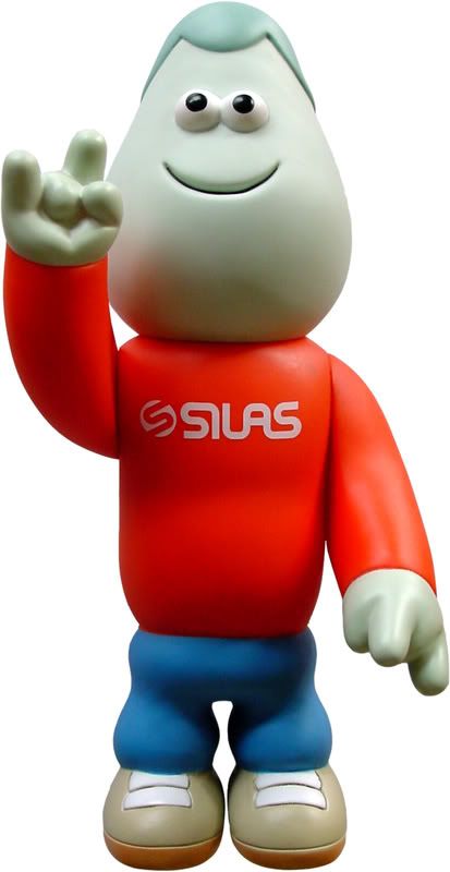
Jarvis' work displays a very distinct style, which although may not appeal to me personally, has clearly been successful. There is a very apparent association between his 2D and 3D pieces, which share many characteristics. For instance as we can see in the image of Martin above, Jarvis' style has a somewhat simplistic appearance, where each feature of the figure is exaggerated and detail is perhaps less than realistic.
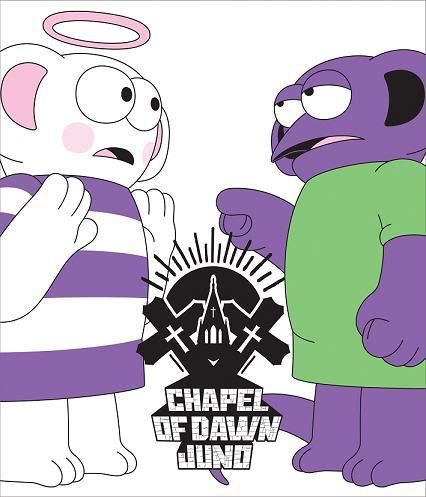
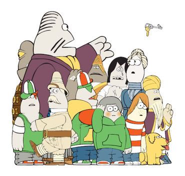
Now if we look at some of Jarvis' other works we are can clearly see how he maintains this distinct visual style throughout his work.
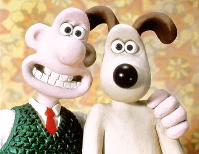
Perhaps the first thing we might notice is the way in which he positions the eyes of his characters very close together. A characteristic also adopted by Nick Park for Wallace&Gromit, (see below). However this is not the only similarity shared, as we may also notice the similarity in body designs. For instance the two styles are quite soft and rounded in appearance. On the other hand there are also some distinct differences in these two styles. Such as Jarvis' characters rarely have noses, yet Parks' characters do have a slightly higher level of detail.
An illustrator by nature, Jarvis' background shines through in all his work. As we can see from the 2D work above, they share the same simplistic traits of the Martin toy he is so widely known for. As much as I may like to not become involved in the current fad for 'designer toys' it is after all a fad or trend and as such I acknowledge that as a design student I am susceptible to it and similar trends. Overall I do not consider this work to have a direct influence on my own practice. However I think this style would work well in an animation or web-based context.


No comments:
Post a Comment